- Lightwave
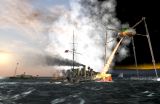
The War Of The Worlds album cover
I've always wanted to have a go recreating this - I'd done an early version of the Martian a while back, so now it needed putting into context.
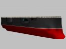
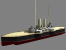
Thunderchild
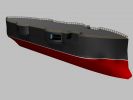
I started with Thunderchild:
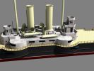
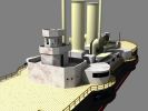
I used LWCAD for the railings down the side.
The cover
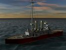
I slotted the Martian in with Thunderchild, and started work on modeling and positioning things:
Wakes
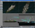
I needed to create the wakes for the various entities - a down view was very handy in doing this:
Smoke
There's quite a bit of smoke in the album cover, and it was a matter of experimenting to get it right:
The smoke from the ships' funnels was done as a timed particle release
Heat-ray
The heat-ray was the next thing to be tackled:

I did have another picture, but it got lost...
Spray
As Thunderchild is moving along, it's generating some spray - it took a few attempts to get it to look okay...
People on deck
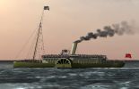
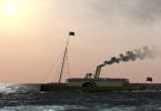
The steamer in the background is meant to be full of people - so I created some low polygon people and dotted them around the steamer. In order to reduce rendering time, I removed the steam, fire and heat-ray. The other hypervoxels didn't seem to take too much time, so I left them in there. And I eventually put people on the deck of Thunderchild.
Glowing Thunderchild
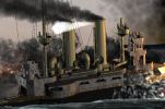
The front of Thunderchild needs to glow as the heat-ray is hitting it. This also took a while to get right:
More work on the smoke
My computer crashed during rendering a version with all the effects in (due to a motherboard fault), so instead of re-rendering it, I decided to spend a bit more time on the smoke, and flames on the deck:
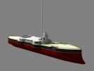
Martian
The Martian wasn't quite right, so it needed some work, which also involved changes to the heat-ray:
There were a couple of times when it went wrong - for example, the odd circular background (which you wouldn't see anyway), and the pink smoke - which I left because I wanted to see how the people looked on the deck of Thunderchild.
HDRI background
In order to solve the circular background problem (so you could actually change the angle), I found an HDRI image to replace the background:
Getting close to finishing
I did a full-size render of the cover shot - the Martian does look different, but I'm going on the original sketches by the artist (Michael Trim) where he shows the top, front and side views of the Martian body.

A new background image
I installed Vue5, and got it to produce a much better background image:
Land and sea
I wasn't quite happy with the land and sea, so starting with the sea, I did some more work. Like before, this took a while to perfect:
I created some new views to verify what was happening with the smoke on the land - and also revisited some of the earlier ones to make sure it was still working correctly
Higher resolution
I was asked about a higher resolution version - but before doing this, I wanted to check that the people on the steamer would still look okay when rendered at twice the resolution I had been working towards:
Final version
This is the last render I did of the cover.
